Unified experience
Unified experience
Designed back in 2019, Globo’s checkout system went through years of constant feature growth without any updates to its core layout or architecture. Over time, this made the interface confusing, hard to read, and full of accessibility issues. The goal of this project was to completely rebuild the purchase experience from scratch. We aimed to simplify the entire journey, making it highly intuitive for millions of users while meeting all of our current business needs.
My main role was to guide a pool of three designers—one senior, one junior, and an intern—throughout this massive and complex project. I mentored the team during the entire creation phase and led the extensive developer handoff and QA (homologation) processes, ensuring every detail was built to high standard.
(Jan 2026)
+
+
(Jan to Dez 2025)
CHECKOUT WEB PROJECT
2025
New Checkout
CONTA GLOBO • GLOBO

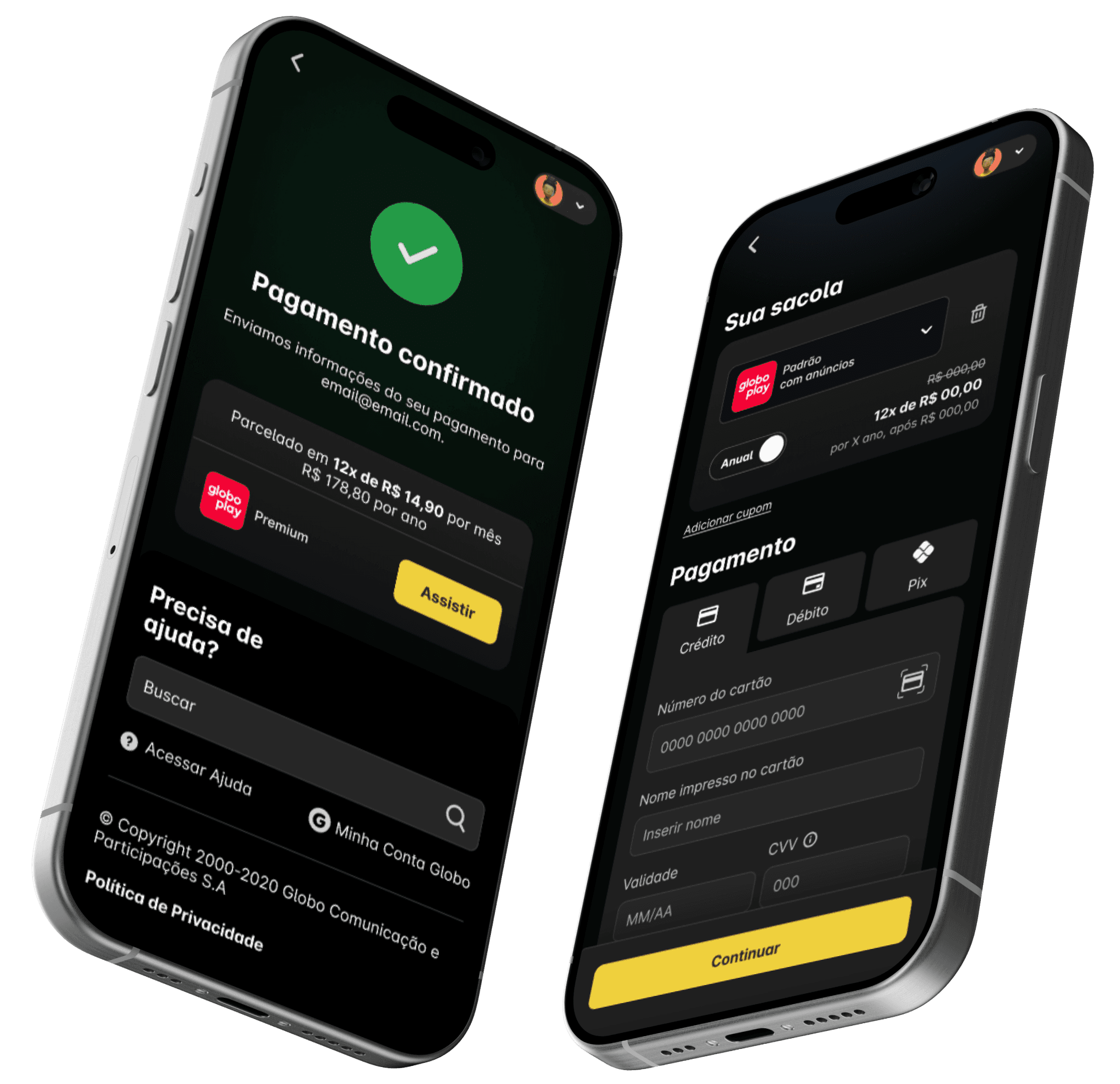
The legacy checkout suffered from a weak brand identity, severe color contrast issues, and critical accessibility gaps. The interface was heavily text-based with minimal visual support, creating a cluttered and overwhelming layout. Furthermore, years of scaling product complexity forced the use of outdated library components that were chosen simply to fit the data rather than to display it optimally. This heavy design was compounded by a major environment mismatch: the checkout was restricted to light mode, forcing a visual disruption transition for users arriving directly from Globoplay’s natively dark ecosystem.

Since this checkout handles subscription-based products, building a highly flexible component system was critical. We had to design for a massive variety of scenarios, including monthly and annual plans, upfront and installment payments, Pix, and third-party partner integrations. On top of that, each product carried its own pricing, rules, and unique benefits—whether sold individually or as part of a bundle. The design system also had to seamlessly adapt to different user states, supporting first-time buyers, returning customers, plan upgrades, and downgrades without breaking the core experience.
Managing Complexity

Interface Overhaul


To bring this system to life, the entire interface was overhauled. While strictly adhering to the "Conta Globo" design tokens and guidelines, we modernized the visual language to deliver a premium digital experience. More than a aesthetic refresh, we introduced high-impact features directly into the checkout flow that did not exist before. Users can now switch between monthly and annual cycles, or even upgrade/downgrade their subscription tier on the fly. To mitigate drop-offs, we embedded transparent billing details contextualized to the chosen payment method, resolving friction points before the purchase is finalized. Finally, we empowered users with dynamic flexibility: an up-sell recommendation carousel allows them to discover and add complementary products inline, while an optimized summary bag lets them easily remove items before completing the transaction.